Rows: 18 Columns: 4
── Column specification ────────────────────────────────────────────────────────
Delimiter: ","
chr (3): Question, Gender, Response
dbl (1): Percent

ℹ Use `spec()` to retrieve the full column specification for this data.
ℹ Specify the column types or set `show_col_types = FALSE` to quiet this message.
Attaching package: 'scales'

The following object is masked from 'package:purrr':

    discard

The following object is masked from 'package:readr':

    col_factor
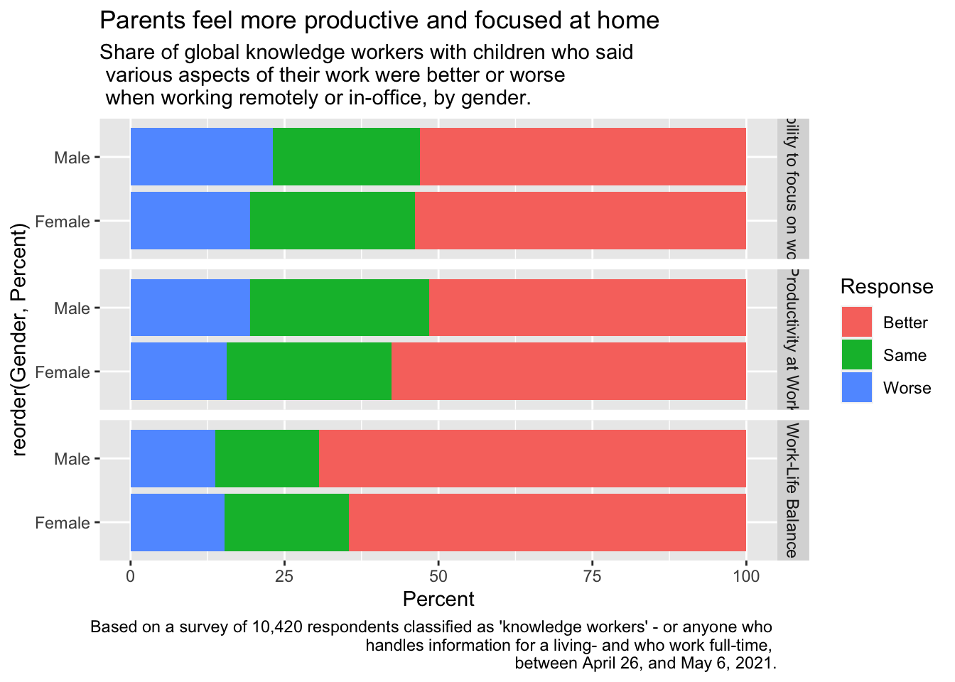
view(Visualization_Data)p<-ggplot(data=Visualization_Data, aes(x=reorder(Gender, Percent), y=Percent, fill=Response)) +geom_bar(stat="identity") +coord_flip() +facet_grid(Question ~ .) +labs(title="Parents feel more productive and focused at home", subtitle="Share of global knowledge workers with children who said \n various aspects of their work were better or worse \n when working remotely or in-office, by gender.", caption="Based on a survey of 10,420 respondents classified as 'knowledge workers' - or anyone who \n handles information for a living- and who work full-time, \n between April 26, and May 6, 2021.") p
##Lets change the colors and play around with those titles and axes
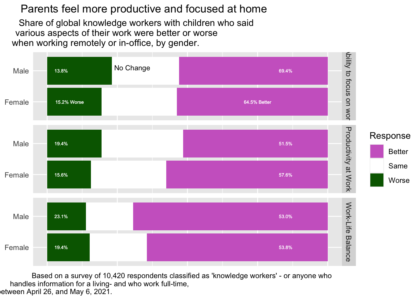
#Lets add the caption library(shadowtext)p2 <- p +geom_shadowtext(data=subset(Visualization_Data, Response=="Same"& Gender=="Male"& Question=="Ability to focus on work"),aes(y = Percent, x = Gender, label="No Change"), hjust=0, nudge_x=0.1,color="black",bg.colour="white", size=3) +scale_fill_manual(values=c("orchid3","white","darkgreen")) +theme(axis.title.x=element_blank(), axis.title.y=element_blank(), plot.title=element_text(hjust=-0.2), plot.subtitle=element_text(hjust=-0.2), plot.caption=element_text(hjust =-0.2), axis.text.x=element_blank(), axis.ticks.x=element_blank(), axis.ticks.y=element_blank())p2
#
Not bad…
I really strugged to get the titles on top and add some values to the graph. Per Annabella’s suggestion I am going to try to add some percentage labels.
p3 <- p2 +geom_text(data=subset(Visualization_Data, Gender=="Female"& Question=="Ability to focus on work"),aes(y =8, x ="Female", label="15.2% Worse"),size=2, color="white",bg.colour="orchid3") +geom_text(data=subset(Visualization_Data, Gender=="Male"& Question=="Ability to focus on work"),aes(y =5, x ="Male", label="13.8%"),size=2, color="white",bg.colour="orchid3") +geom_text(data=subset(Visualization_Data, Gender=="Female"& Question=="Productivity at Work"),aes(y =5, x ="Female", label="15.6%"),size=2, color="white",bg.colour="orchid3") +geom_text(data=subset(Visualization_Data, Gender=="Male"& Question=="Productivity at Work"),aes(y =5, x ="Male", label="19.4%"),size=2, color="white",bg.colour="orchid3")+geom_text(data=subset(Visualization_Data, Gender=="Female"& Question=="Work-Life Balance"),aes(y =5, x ="Female", label="19.4%"),size=2, color="white",bg.colour="orchid3") +geom_text(data=subset(Visualization_Data, Gender=="Male"& Question=="Work-Life Balance"),aes(y =5, x ="Male", label="23.1%"),size=2, color="white",bg.colour="orchid3") +geom_text(data=subset(Visualization_Data, Gender=="Female"& Question=="Ability to focus on work"),aes(y =75, x ="Female", label="64.5% Better"),size=2, color="white",bg.colour="darkgreen") +geom_text(data=subset(Visualization_Data, Gender=="Male"& Question=="Ability to focus on work"),aes(y =85, x ="Male", label="69.4%"),size=2, color="white",bg.colour="darkgreen") +geom_text(data=subset(Visualization_Data, Gender=="Female"& Question=="Productivity at Work"),aes(y =85, x ="Female", label="57.6%"),size=2, color="white",bg.colour="darkgreen") +geom_text(data=subset(Visualization_Data, Gender=="Male"& Question=="Productivity at Work"),aes(y =85, x ="Male", label="51.5%"),size=2, color="white",bg.colour="darkgreen")+geom_text(data=subset(Visualization_Data, Gender=="Female"& Question=="Work-Life Balance"),aes(y =85, x ="Female", label="53.8%"),size=2, color="white",bg.colour="darkgreen") +geom_text(data=subset(Visualization_Data, Gender=="Male"& Question=="Work-Life Balance"),aes(y =85, x ="Male", label="53.0%"),size=2, color="white",bg.colour="darkgreen")